

Role
Senior Visual Designer
Scope
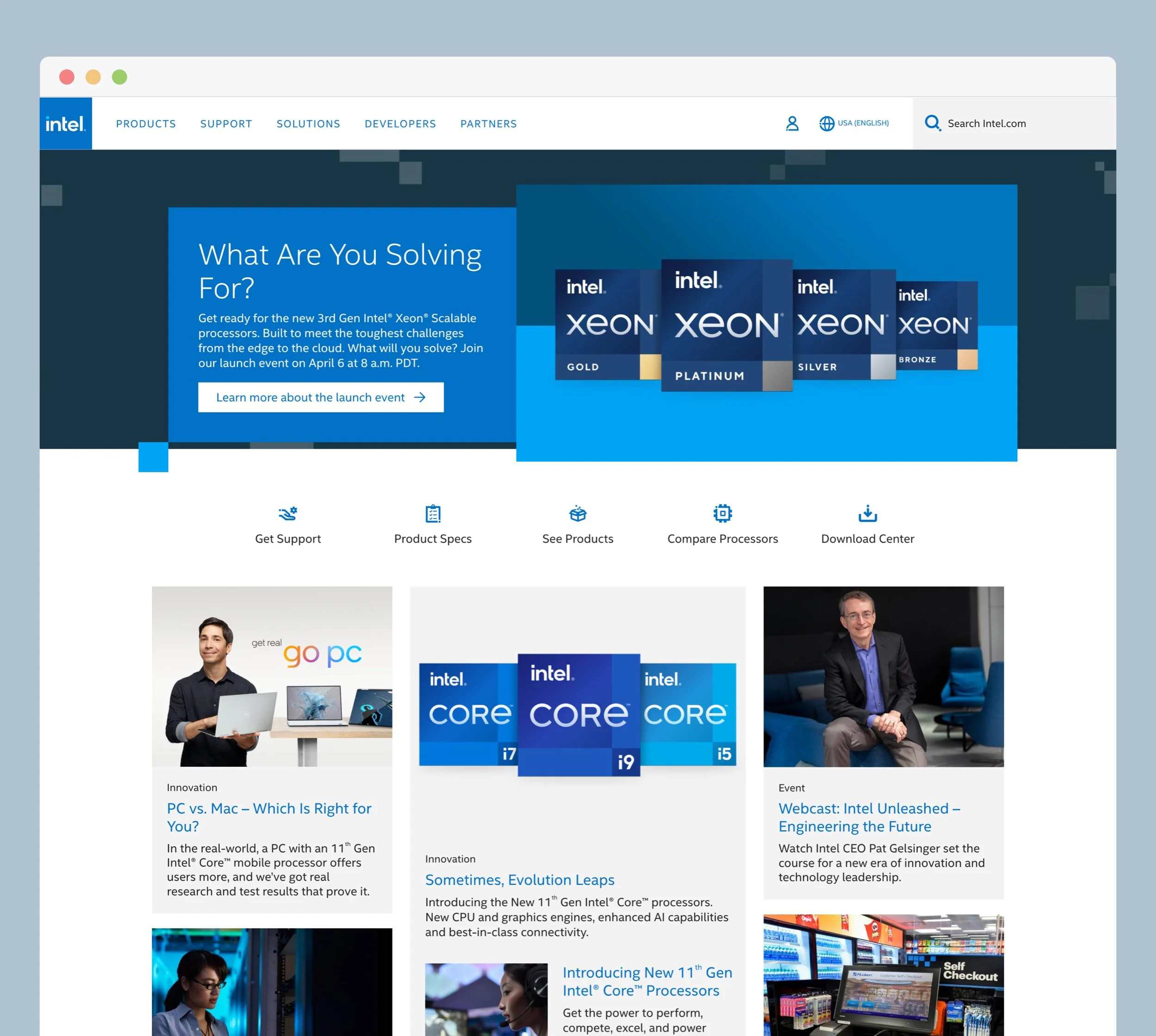
Enterprise website redesign aligned to global brand refresh, including layout systems, typography, and component styling.
Key Contributions
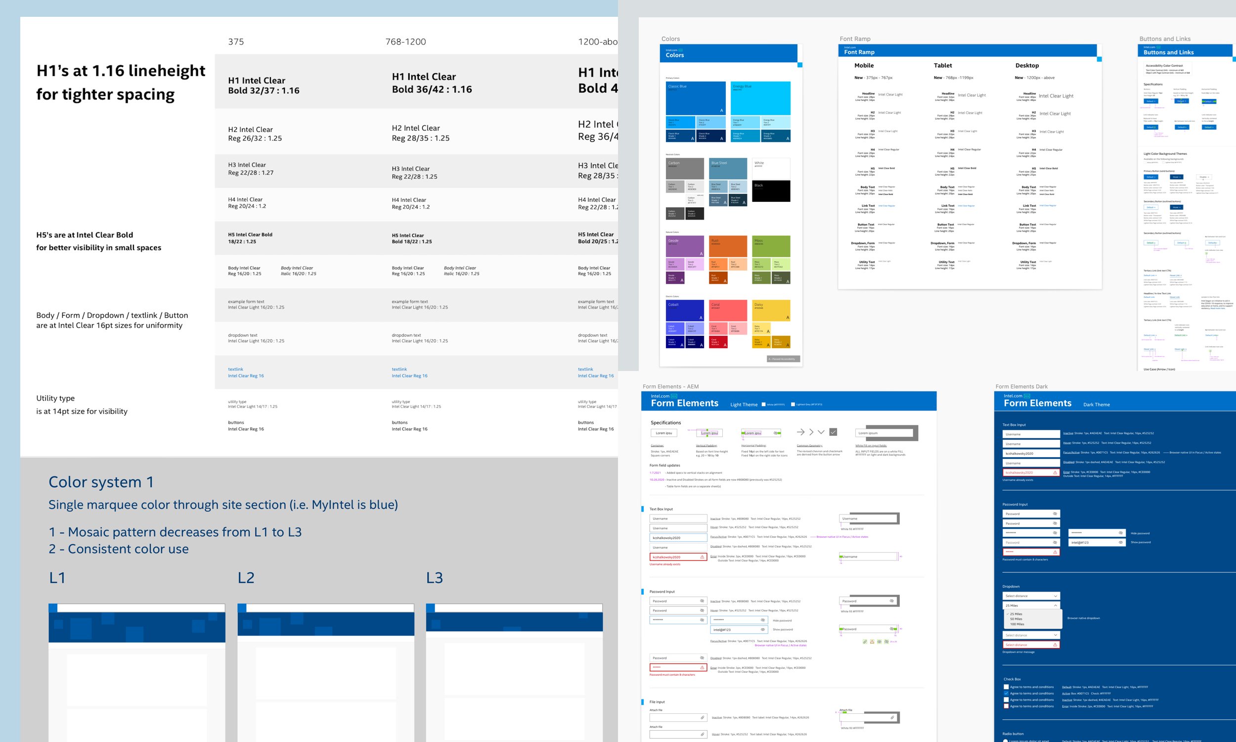
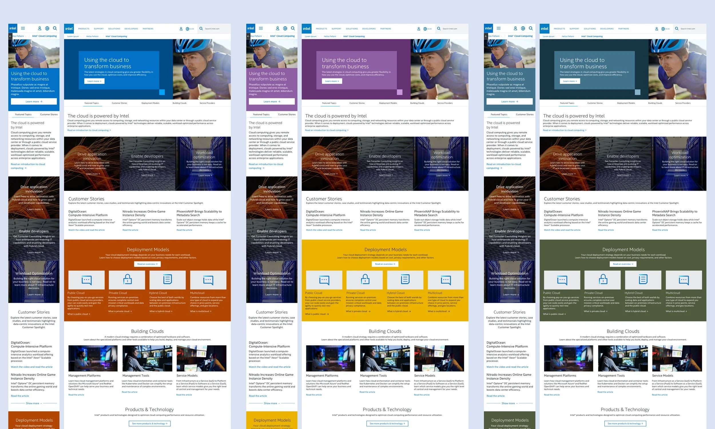
Visual system application across templates
Typography and color system implementation
Desktop and mobile layout design
Brand-to-digital translation
Constraints
Large content surface area
Strict brand governance
Multiple stakeholders

Design System Foundations


Brand-Driven Page Variations

Project
Enterprise website redesign · Digital rebrand implementation
My Role
Senior Visual Designer — visual systems, UI production, responsive layouts
Team
Creative direction, UX, program management, and internal engineering teams